Progress Notes — Landing Page Visual and IA Design
I’m building a site for the Witch Lights, intended to close the feedback loop between people seeing an appearance of the lights, and becoming involved. The site’s focus currently is on being a landing page, with clear calls to action.
I used the desktop layout to prove out a visual language. The main content of the site will feature images and video of the Witch Lights under low-light conditions, so the color palette is dark with complementary and neighboring colors for accents.
My hypothesis is that, if we start having the Witch Lights appear along trails in the spring, people will encounter them and be called to action to sign up for announcements of future appearances and more.
Peoples’ reactions to encountering the Witch Lights for the first time can be intense, often emotional. I’m hoping to engage that reaction by giving people a fun, free way to get involved in spreading that experience.
If a guest wants to find out more while they’ve just encountered the Witch Lights outside, they’re most likely to access the site via their phone, so that was the priority. Also, I find designing the mobile site first forces you to focus.

People always have a number of questions, but “what is this” tops the list. I wanted to make sure that people can find the answer to that question in the crucial few moments of evaluation, if they found the site URL in their notebook or pocket a few days or weeks later. This (perhaps obviously) needs to be user tested ASAP.
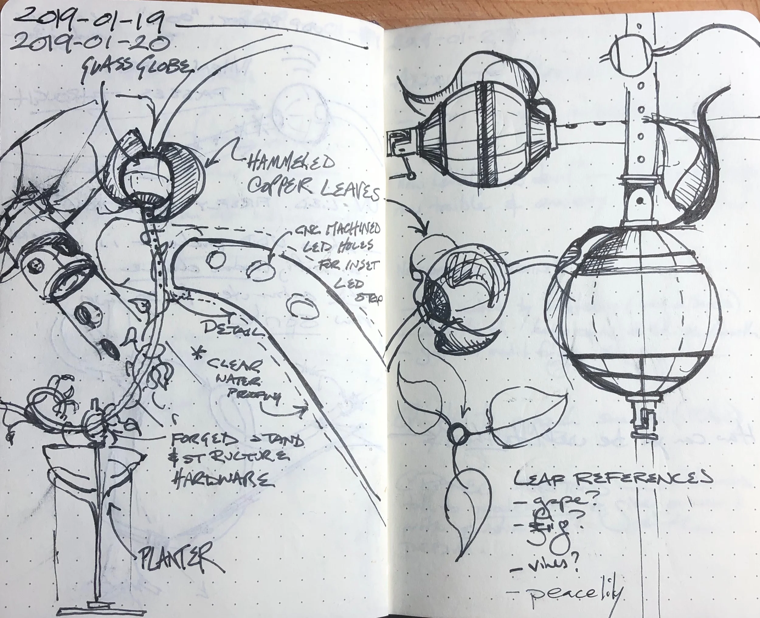
A design goal is to make sure that if someone is flipping through and just scanning headlines, they can understand what the Witch Lights are, and how that’s relevant to them (aka, why do they care?). The “what is this?” panel was a great place to start, and helped build a kind of visual language; here’s a few historical iterations.


So far, the visual and content elements we have are:
A hero image and call to action
Information and call to action panels
Annotated, animated silent looping movies, showing the Witch Lights in action.
(Desktop) A footer with a final call to action and another place for “what is this?” in case someone scrolls rapidly and misses context.

In future updates I plan to show how the entire site is built on nested symbol overrides and shared styles, as well as how the visual design came together.