Practical Technomancy
IMG_7592.jpeg

Blog

Thinking out loud

Progress Notes — User Flows & Appearances

We developed some early personas in the Witch Lights working group sessions this fall. We used rapid, lightweight discovery activities to prioritize what elements of this site would meet both the personas’ goals and the key business objectives for the Witch Lights.

Our goal was to help Zoë, our primary guest persona, to find Witch Lights appearances near her so that she can share the experience with a friend. Thus, the most important interaction design for this site would be the appearance schedule.

2019-10-23_12-15-51--proto-personas-witchlights.png

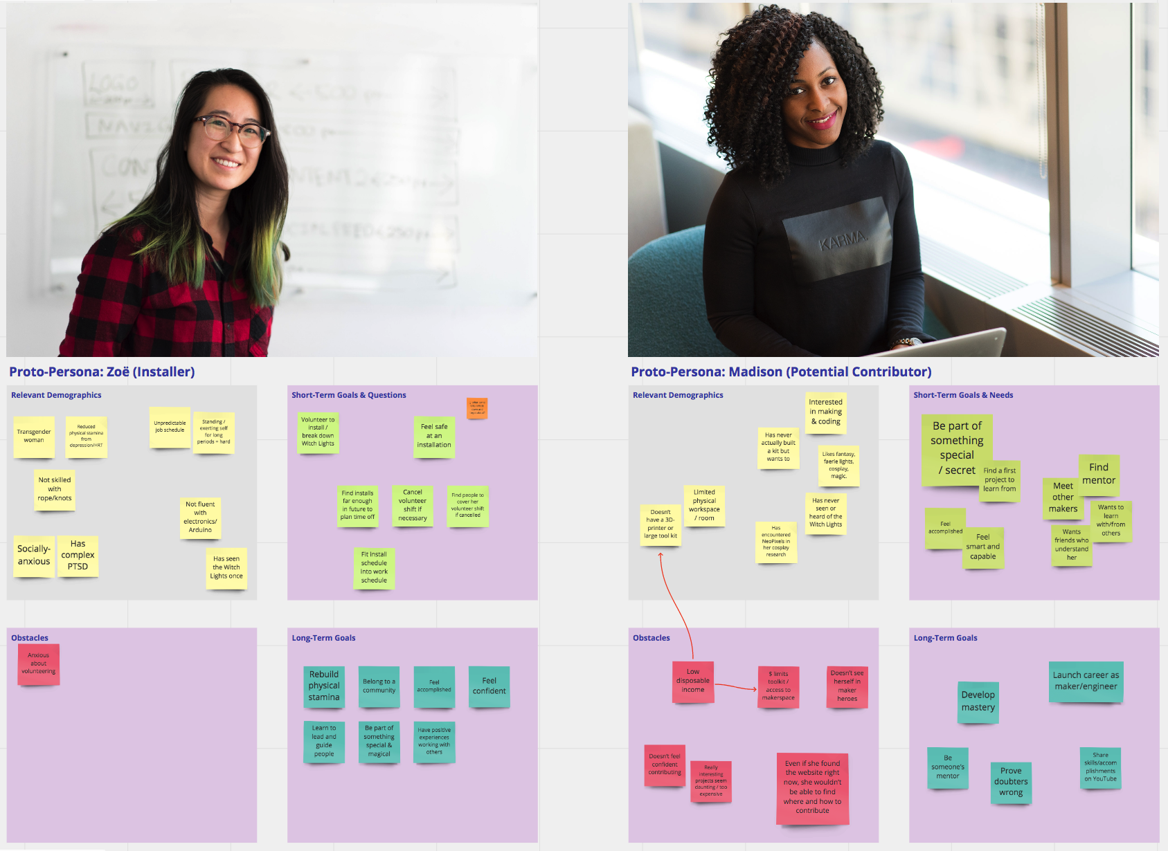
First, we hashed out a rough scenario, to provide context: Zoë stumbles across the Witch Lights while walking her dog, and gets a sticker with the site URL on it. She wants to find the next appearance and bring her best friends, and has to find a location and day that works with her and her friends’ schedules and limited transportation options. Zoë has a minor mobility disability, and needs to be certain that she’ll be able to do it without much pain, and her irregular retail schedule is also a complication.

I spent some time bashing out a kind of concept model diagram of how an appearance schedule might work. This was mainly to get the system-model thinking part of my brain to shut up and relax, so that I could focus more on thinking about designing from Zoë’s perspective.

Xnip2019-12-21_18-53-16.png

A number of functions seemed like good candidates for button to nowhere experiments.

Having satisfied my system itch, I stepped back into Zoë’s shoes, and hashed out a scenario based on my experience with prior Witch Lights appearances and workshops.

I brainstormed the scenario out into chunks, and then went back through to pull the goals, questions, and other needs out of the story. Then I used the content and action from the system model as a source of material that could satisfy the needs and the actions described in the scenario.

This provides a clear framework of user flow, which helps greatly in terms of prioritizing what content and interaction elements need to be built.

I let that simmer a bit, and then came back and broke the flow down a bit more into what Zoë sees and does. That is, starting to chunk the content elements and action elements into groups.

The purpose for this exercise is to provide a clear framework for content-aware design. Before sketching and building screens, I want to know:

  • Primary headers

  • Link and button names

  • Rough information architecture

  • State changes

The next step is to do some simple, high-level screen sketching based on the flows, and do some rough testing to hash out whether I’m on the wrong track.

Progress Notes — Nested Symbols & Overrides

The Witch Lights landing page design makes extensive use of nested symbols and symbol overrides, to maximise reuse and speed. For example, the main hero block is entirely made of nested symbols, using Smart Layout to dynamically resize elements.

Xnip2019-12-16_20-19-09.png
2019-12-16_20-22--coven-nested-symbols.gif

Every button is a molecule symbol made of atom symbols, which can be dynamically overridden, along with color and content.

This approach makes it easier to make wide-ranging design adjustments, and stack symbols together like lego blocks.

Xnip2019-12-16_20-27-44.png

Color symbols in turn allow the entire site’s branding or color palette to be swapped out. Gradient symbols have the exact same dimensions as the color symbols, so they can be substituted for any flat color as well.

Xnip2019-12-16_20-31-06.png
Xnip2019-12-16_20-12-50.png

I used a number of example files—such as InVision Form—as a guide for things like the taxonomy structure of the nested symbols, as well as how color symbols, text symbols, shapes, and masks fit together. In most cases, I built all the visual elements myself, using existing elements for inspiration. In other cases, like these mobile navbars, I started with some existing elements and rebuilt them.

Xnip2019-12-16_20-33-08.png

It was fun to get these symbol overrides to work, though. It’s nice to be able to just make a single molecule and then swap out the atoms interchangeably.

Xnip2019-12-16_20-33-44.png
Xnip2019-12-16_20-34-22.png

“System/#0” was intended to have enough contrast from the darker, less saturated “System” colors that make up the background so that they stand out a bit, but not as much as the “Accent” colors. Accent colors are yellow (complementary to System purple), green (adjacent to yellow), or blue (adjacent to purple), high saturation, and much lighter in value than all System colors. That’s why the navbar icon above uses it: I don’t want it to be distracting, but you should be able to find it if you’re scanning for a home button.

This was all quite a bit of work, but the result of it is that I can focus on the content, which is the key element in this effort. And it allows me to adjust and iterate that content with a minimum of visual adjustment. This, in turn, will hopefully enable rapid experimentation to test value hypotheses and find the right mix of persuasive elements to build this community.

Progress Notes — Landing Page Visual and IA Design

I’m building a site for the Witch Lights, intended to close the feedback loop between people seeing an appearance of the lights, and becoming involved. The site’s focus currently is on being a landing page, with clear calls to action.

I used the desktop layout to prove out a visual language. The main content of the site will feature images and video of the Witch Lights under low-light conditions, so the color palette is dark with complementary and neighboring colors for accents.

My hypothesis is that, if we start having the Witch Lights appear along trails in the spring, people will encounter them and be called to action to sign up for announcements of future appearances and more.

Peoples’ reactions to encountering the Witch Lights for the first time can be intense, often emotional. I’m hoping to engage that reaction by giving people a fun, free way to get involved in spreading that experience.

If a guest wants to find out more while they’ve just encountered the Witch Lights outside, they’re most likely to access the site via their phone, so that was the priority. Also, I find designing the mobile site first forces you to focus.

Xnip2019-12-16_20-05-35.png

People always have a number of questions, but “what is this” tops the list. I wanted to make sure that people can find the answer to that question in the crucial few moments of evaluation, if they found the site URL in their notebook or pocket a few days or weeks later. This (perhaps obviously) needs to be user tested ASAP.

A design goal is to make sure that if someone is flipping through and just scanning headlines, they can understand what the Witch Lights are, and how that’s relevant to them (aka, why do they care?). The “what is this?” panel was a great place to start, and helped build a kind of visual language; here’s a few historical iterations.

Xnip2019-12-16_20-12-50.png

So far, the visual and content elements we have are:

  1. A hero image and call to action

  2. Information and call to action panels

  3. Annotated, animated silent looping movies, showing the Witch Lights in action.

  4. (Desktop) A footer with a final call to action and another place for “what is this?” in case someone scrolls rapidly and misses context.

In future updates I plan to show how the entire site is built on nested symbol overrides and shared styles, as well as how the visual design came together.