


In November of 2013, we hosted our wedding at a historic memorial library in Branford, CT.
As a fun, whimsical idea, I decided to design invitations, which would take the form of custom dust jackets and inserts in an assortment of used hardcover books. We sourced the books from library sales, used book stores, and donations, and each book was selected to suit their intended recipients.
The invitations ended up shaping the rest of the graphic design and visual elements for the entire event. The result was a graphic language that integrated with and paid homage to the existing signage and typography of the library itself.
The invitations' personalized book selection both presented interesting design challenges to overcome, and added emotional resonance to the resulting final artifacts.
Above, a copy of the invitations we kept for ourselves, wrapping Hound of the Baskervilles, by Arthur Conan Doyle.
Below, a copy of Catch 22, by Joseph Heller, sent to an old friend whose copy of Catch 22 I had lost, years before. I asked them for a picture in 2018, and they still had it available.
Our first thought after selecting the library as our venue was not, "Hey, let's create a massive design project with a fixed and stress-inducing deadline and ever-expanding scope!"
No.
We went on Etsy.
Because that's what you do.
And we found library themed designs, but they were all lacking something.
The representative sample above illustrates what we did not like about existing library-themed invitations.
As the daughter of a librarian, Erika felt strongly that the use of the visual elements should align closely with their purpose. And found their misuse to be viscerally jarring.
So in this example, the use of the library checkout card is just wrong. The text ignores and violates the format of the card, which is in turn glued into a folder, something you would never actually do with a checkout card.
There were other issues with this and similar designs, but my purpose isn't to rag on a fairly nice-looking and clever mixed-material design. The point is that my client --my bride-to-be-- established a firm design principle: that the use of media be according to its actual purpose in a library.
I explored a number of different designs. Above, an experiment in making fake paperback book covers modeled after the famous Penguin Books Marber Grid.
We didn't pursue this one much further, because the design of the cover didn't really inspire the rest of the elements needed, such as the date, directions, RSVP card, etc. It was kind of an isolated thing.
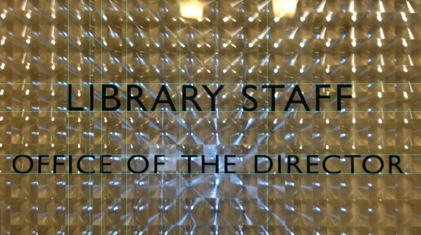
The Blackstone Memorial Library has a striking and timeless typographic language for its signage, which is carried through in all their information kiosks, maps, and other elements through the library. I was struck by the obvious signs of age on the sign above, which stand in contrast to the clean, modern design of its type and layout.
What if, I thought, we echoed our venue's typography in the printed visual elements for the wedding? So we tried it out.
It helps that I really like letterspaced Gill Sans.
I used illustrator to work out the grid and character proportions and spacing of the original signage.
As it happens, the proportion of whitespace to the text in some of their signs is a 1:1.618 ratio.
While experimenting with graphic language, we were experimenting with (and discarding) various designs, centered around one element that was decided upon very early: a library checkout card listing significant dates in our relationship, with date stamps.
As a joke, I proposed that the most authentic way to deliver a checkout card was inside a real book.
"Oh, no," Erika said. "There is absolutely no way that we are going to choose personalized books for each and every couple we are inviting to our goddamned wedding."
So, obviously that is exactly what we did.
My process is to get hands-on as quickly as possible, with rough mockups, in order to establish what the shape and components of the problem being faced are.
One problem that was identified early on was that we were buying used (for budget reasons) hardcover (for aesthetic reasons) books. They don't come in standard sizes. In fact, we soon discovered that our selections came in a huge variety of thickness, width, shape, and color. Some were large-format children's books. Some were very old pocket-sized books.
A successful design would have to work with any and all of these variations, without having to be carefully customized or fitted.
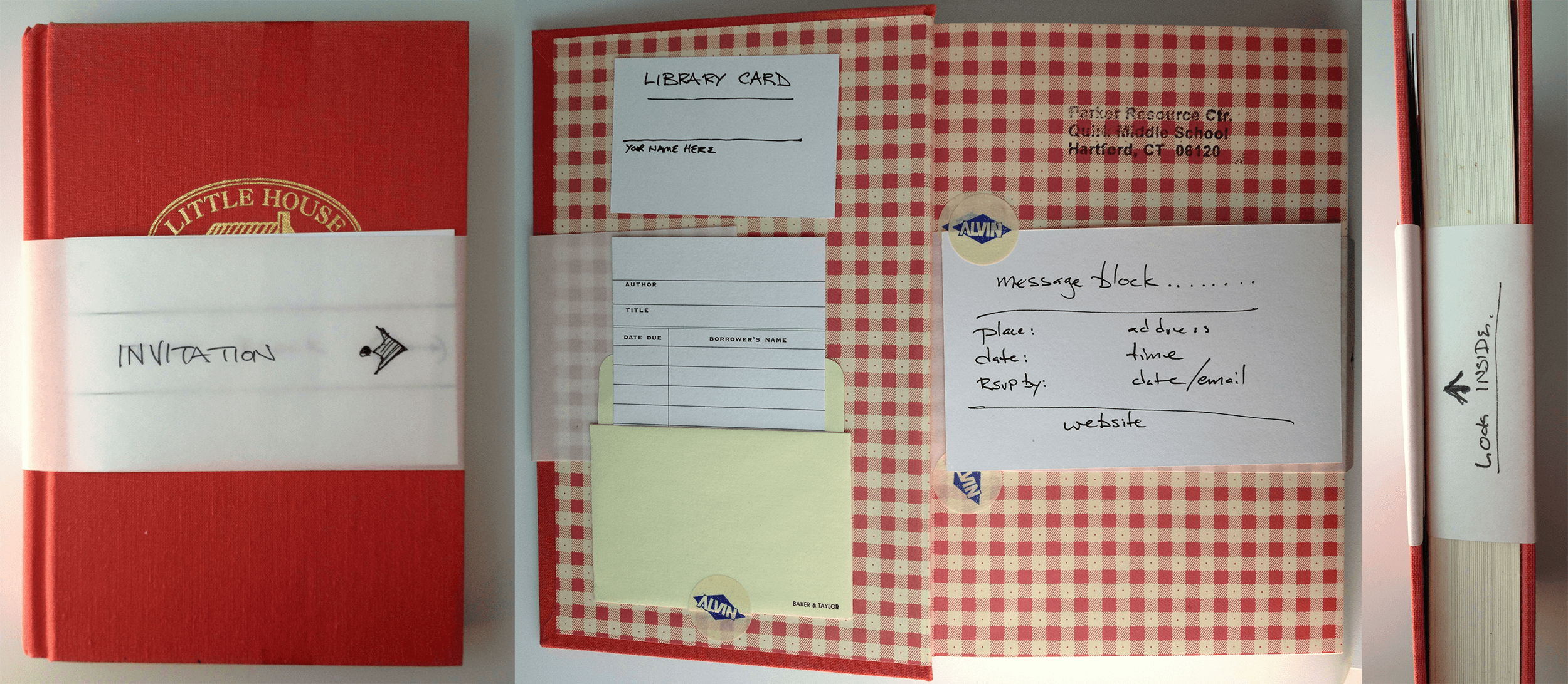
To accomodate the different shapes of book covers, the dust jacket was cropped down to a paper band, anchored on the first page and wrapping all the way around the book.
I experimented with different widths and colors for the band, and eventually settled on using translucent vellum, which would work with whatever color the book's cover happened to be.
(Many of the mockups and experiments were rapidly tried, then stripped apart and cut up, then tried again. In the stress of wedding plans and a short deadline, I don't have my usual full set of documentation of these experiments.)
Another idea hit upon early was the use of a library card for RSVP. We didn't have examples of Blackstone's library cards, so I invented one (shown above and below).
As an easter egg, the card number was 111013, or 11/10/13 (the big date).
I wanted a clear indicator on the front of each book cover that this was an invitation, and that you should open the book. In my (very haphazard) user testing, printing "invitation →" on the front of the book, and "details inside" on the side, had the desired effect.
But every single book cover sheet was going to have to be a different length, because all the books were different thicknesses and sizes. How to print it so that it always appeared in the correct position?
The solution: have a stamp made. All of the books would be assembled and wrapped, and then the label would be hand-stamped on the front cover.
After many iterations, the invitations took form.
The library checkout card's significant dates were selected after careful negotiations. One notable relationship milestone featured: first trip to IKEA.
Printed information cards and the RSVP card were held tightly by the inset paper cover. When a guest opened the book for the first time, the tension would release, and the cards would gently slip out into their hands.
It is one thing to craft one custom book invitation.
It is quite another to produce 58 of them, especially on a rapidly-approaching deadline.
The vellum wrappers were printed on a large-format printer, and cut out with a razor and straight-edge. Then they were mounted into each book, wrapped, and cut to size.
Library checkout cards were hand-stamped, scanned, and printed. Card pockets had to be assembled, then glued in place in each book.
RSVP cards were hand-stamped and mounted with a removable glue dot. (And let's not talk about how many repositionable mounting techniques we tested and discarded for that.) They got assembled with the information cards (which also went through more design iterations than I care to remember) and inserted into each book.
And, 75% of the way through production, the wrappers began coming un-glued. We had to find a stronger mount process, and take all the books apart and re-attach the wrappers. Tempers began to fray.
Finally, each book got stamped with the custom stamps we had made, and passed off for final inspection and approval.
Then the power went out. For three days.
We wrapped and addressed all the books for shipment using flashlights, and shipped everything out via USPS media mail on the day of the absolute last-minute deadline.
In 2013, it was impossible to get a date stamp with dates going back to 2011. Turns out. We had to modify the stamp for 2017 with a knife and some careful glue work.
The stack of books in production below show a little bit of the variety of sizes and shapes of books used for the invitations. The stacks covered my workbench.
(Unfortunately, in the stress of the moment, I did not document the process as meticulously as I usually do.)
We were determined to carry through the experience that started with the invitations into the event itself.
The RSVP "Library" cards were the key.
They were stuck to the RSVP 5 x 7 index cards using removable glue dots. And so when we received them back, we could peel them off, and repurpose them.
The library cards made for a nice, tangible set of tools for sorting guests into their table assignments. So that was a nice bonus.
To carry forward the cards as an element in the guests' experience at the event, we printed cards for a small card catalog, and mounted the library cards on them.
Each card had the guest's seating assignment on the back.
Above: the seating catalog at the event.
Guests' tables were labeled according to the Dewey Decimal System.
Each table had a Dewey Decimal category, and a selection of used books for that category, which were free for the guests to take home.
Most of the books went home with guests.
We expected our guests would enjoy the invitations. We were not prepared for the intensity of their appreciation.
The books became prized possessions. Years later, I have walked into homes of friends and family to find their invitation book on display. In spring of 2018, when visiting Erika's grandmother, she brought out her book (a vintage copy of Charles Dickens' Life of Our Lord) and proudly declared that it lives on her bedside table and she has been reading it at night.
The careful selection of each book for each guest was a token of our bond to them, and recipients responded strongly to that most of all.
Some say that you should never design for yourself as a client: sometimes it's good to have someone to say "no". Fortunately, this event was a group project, and we agreed to each be critical of each other, and rein each other in when needed.
We felt like we should start this event by giving a gift to the friends and relatives we were inviting, one that would be personally meaningful in some way. A specially-chosen book was appropriate, both thematically and in terms of what we might choose as a personal gift for our friends and relatives.
This project was an education in the use of print and graphic design to create an experience. We focused first on the kind of experience we wanted our guests to have, and made that the core guiding principle of all design decisions. I believe that focus paid off in the quality of the event experience.